Designing Éttore: Translating Form into Identity for a 3D-Printed Lighting Brand
Éttore creates sculptural lighting pieces through high-quality 3D printing, combining aesthetic sensitivity with precision technology. Each object is not only functional but also expressive — with its own shape, soul, and atmosphere.
I was responsible for designing the complete brand identity, translating the essence of their work into a visual system that reflects their philosophy: design with presence, light with personality. The visual language was not imposed from the outside, but extracted directly from the products themselves — making the brand identity an extension of the physical design process.
Project Background
Éttore was founded to break away from generic home decor, aiming to produce objects that feel like design statements — where form, light, and texture come together in a poetic way.
The brand needed an identity that would elevate its artisanal production, reflect its creative obsession with shape, and position it clearly in the premium decor market — while maintaining an approachable, human tone.

Brand Creation Goals
The development of Éttore’s brand identity focused on:
Anchor the Brand in Its Own Forms: Use the brand’s product geometry as the foundation for its visual identity — ensuring authenticity, originality, and relevance.
Design a Scalable Visual System: Create a cohesive set of assets, shapes, and design rules that could expand across digital, print, and physical materials.
Balance Precision and Emotion: Convey both the technical mastery behind the production process and the emotional impact of the final pieces.
Express the Brand's Soul, Not Just Its Style: Develop an identity that communicates the atmosphere, intention, and individuality present in each Éttore creation.


Design Process
The development of Éttore’s brand identity followed a methodical yet intuitive process, with a focus on real-world product integration:
Discovery and Brand Immersion
The development of Éttore’s brand identity followed a methodical yet intuitive process, with a focus on real-world product integration:Form-Based Visual Research
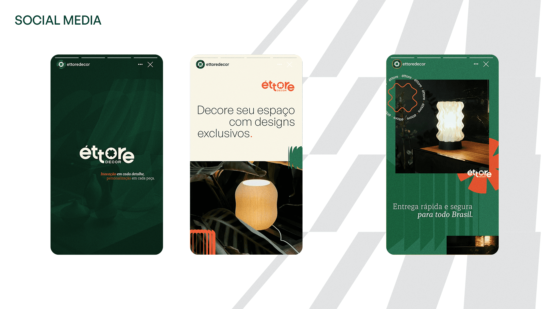
Analyzed top-view silhouettes of actual Éttore luminaires to extract iconic geometric elements. These shapes were used to build the logo symbol, graphic system, and a modular library of design elements.Visual Identity System
Designed a wordmark with refined proportions and timeless elegance. Developed a supporting graphic language using the extracted shapes to create backgrounds, frames, and structural elements.Typography and Color
Curated a typographic system that combines craft and clarity — with expressive titles and highly legible supporting text. The color palette reflects light, material, and warmth, giving space for the products to shine.Application Design
Delivered ready-to-use assets for social media, packaging, product tags, presentation templates, and print materials — enabling the brand to launch consistently and confidently.


Impact and Reflection
Building Bio Blanks from the ground up allowed me to fully explore the challenges and opportunities of creating a brand in the sustainable fashion space. Key learnings from this project include:
Designing from Within
A brand becomes much stronger when its identity system is built from its own DNA — in this case, literally derived from product geometry.
Emotional Minimalism
It’s possible to create a minimal identity that doesn’t feel sterile — by anchoring it in emotion, texture, and meaning.
Scalable Systems from Organic Forms
A flexible visual system can emerge even from non-standard, sculptural inputs — when there’s a clear logic tying the parts together.
Key Elements of the Brand Creation
Logo Design: A custom symbol derived from the top-view geometry of an actual Éttore luminaire, paired with a refined wordmark for balance and presence.
Shape Library: A set of unique graphic shapes created from product silhouettes, used across layouts to create structure, rhythm, and brand consistency.
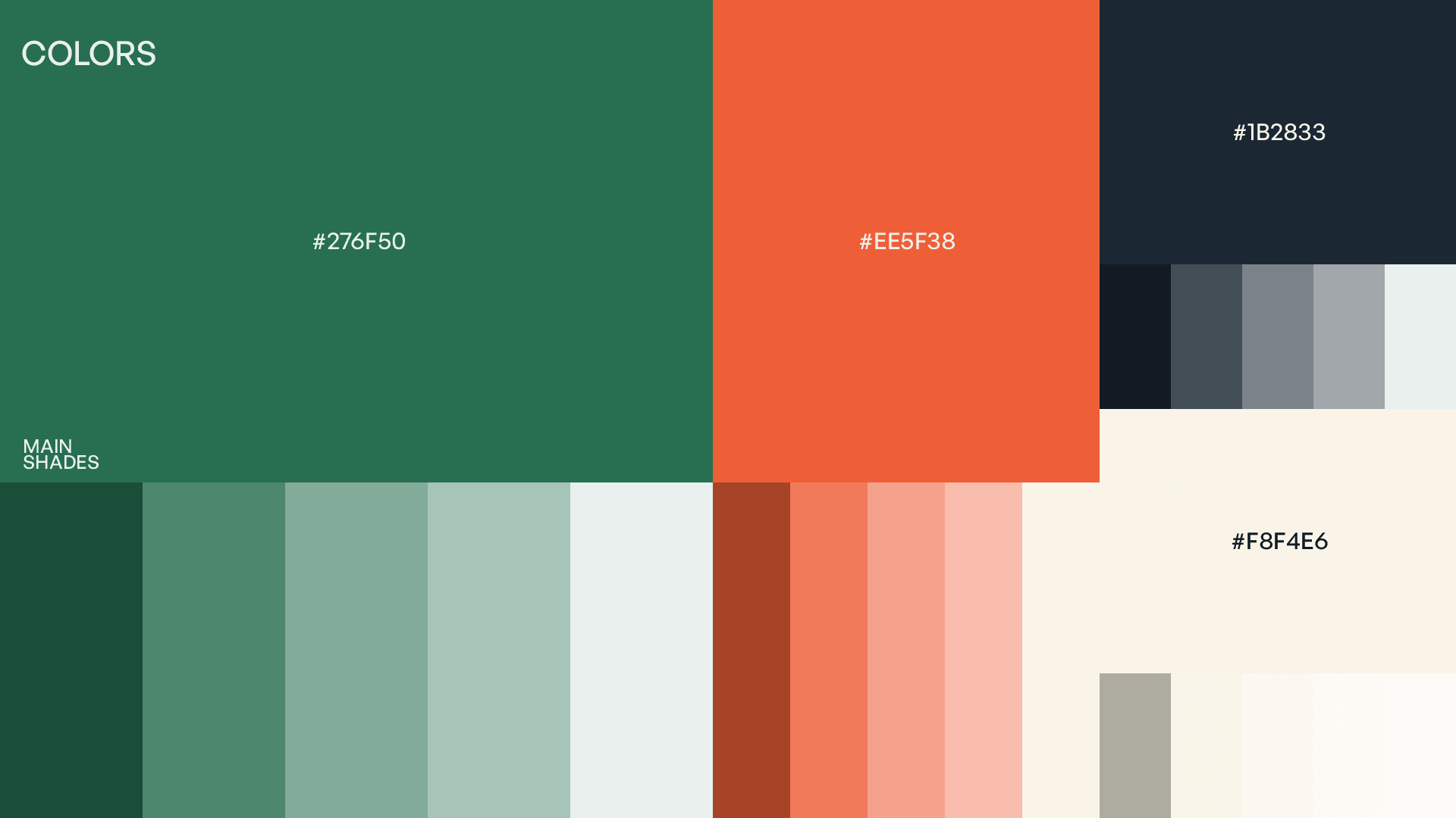
Color Palette: Warm neutrals and deep contrasting tones, reflecting both the physical textures of the products and the light they emit.
Typography: Elegant serif and clean sans-serif combinations, bridging high-end design with clarity and usability.
Applications and Templates: Assets for Instagram, print, packaging, product labeling, and digital presentations — all aligned with the brand’s sculptural, poetic tone.
Conclusion
The creation of Éttore’s brand identity was an exercise in resonance — turning physical form into visual language. By grounding every design decision in the actual shapes, textures, and spirit of the brand, I helped bring to life an identity that doesn’t just represent Éttore — it is Éttore.
This case demonstrates my ability to build brand systems where strategy and form meet, and where identity emerges from the core of what a company creates.