Sicredi Banking App Redesign: Enhancing Usability and Accessibility

As part of a personal initiative, I embarked on a redesign of the Sicredi banking app to enhance its usability and accessibility.
The aim was to create a more intuitive and user-friendly experience, reduce the number of steps required to complete key actions, and improve the app's overall quality by focusing on better readability, accessible design elements, and a modern visual style.
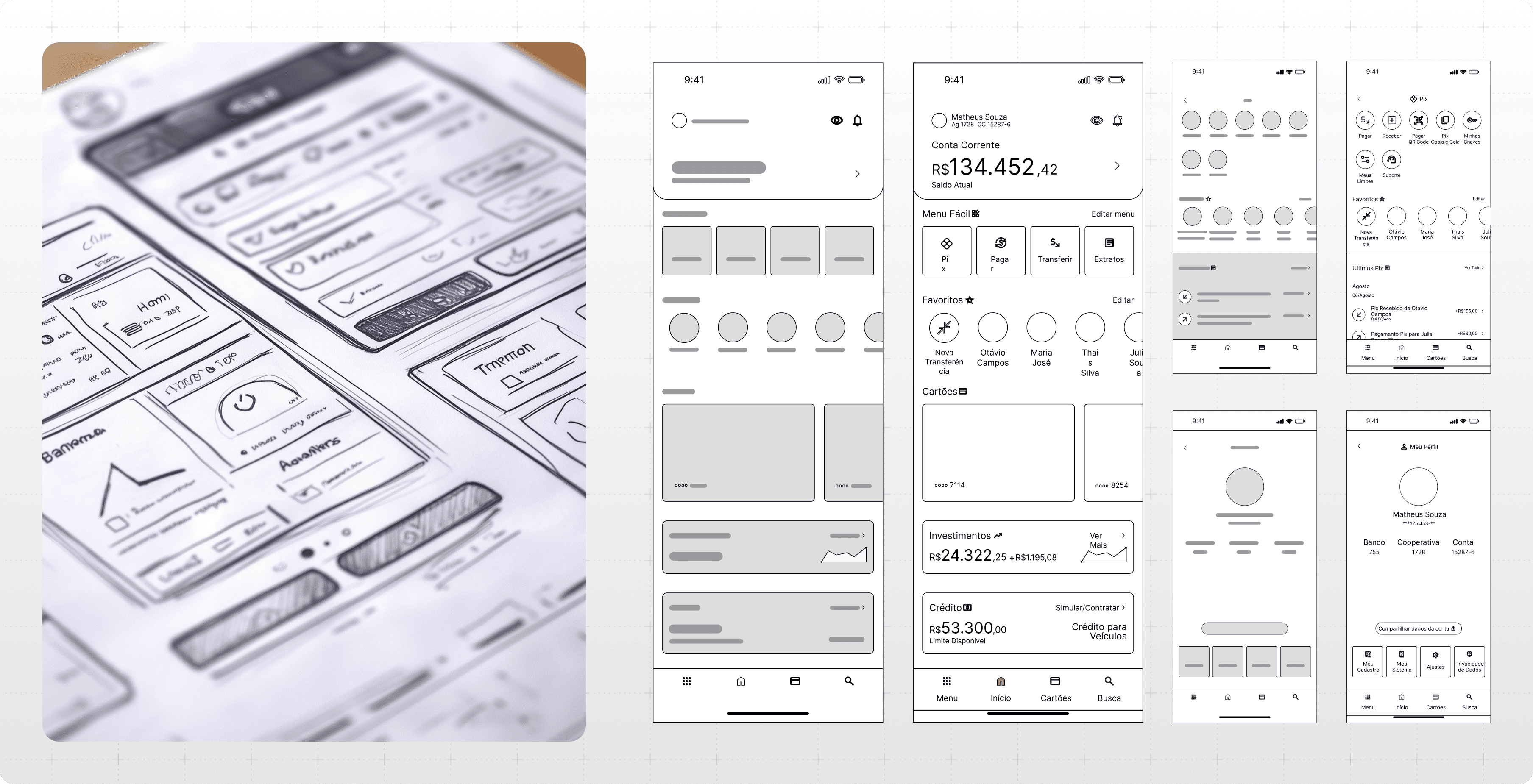
The existing Sicredi app, while functional, had several areas that could be optimized for a better user experience. Based on general UX principles and common design best practices, I identified opportunities to simplify navigation, enhance accessibility, and improve the app's visual appeal.
Challenges Identified
During my research, I identified several key areas where the existing Sicredi app was falling short:
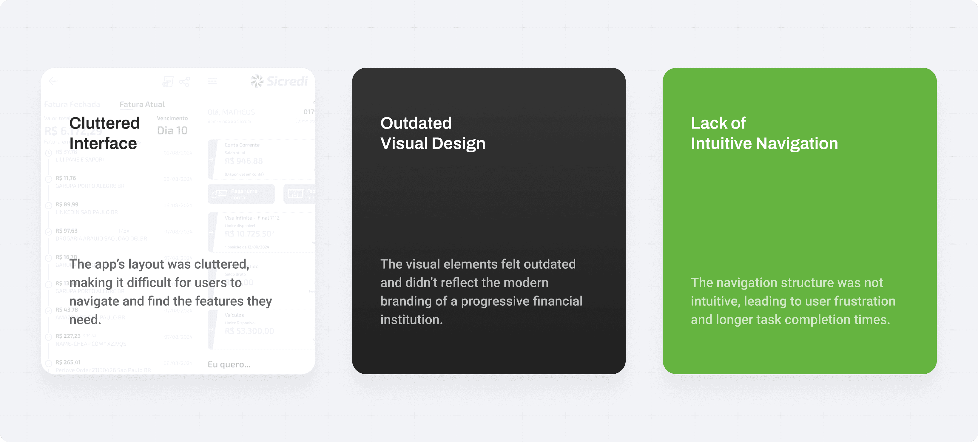
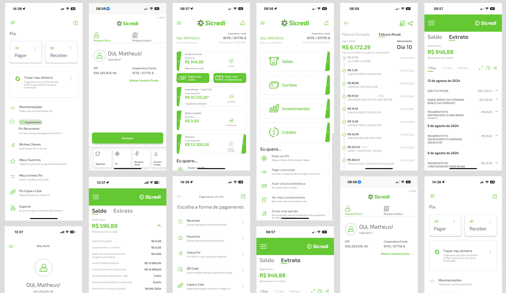
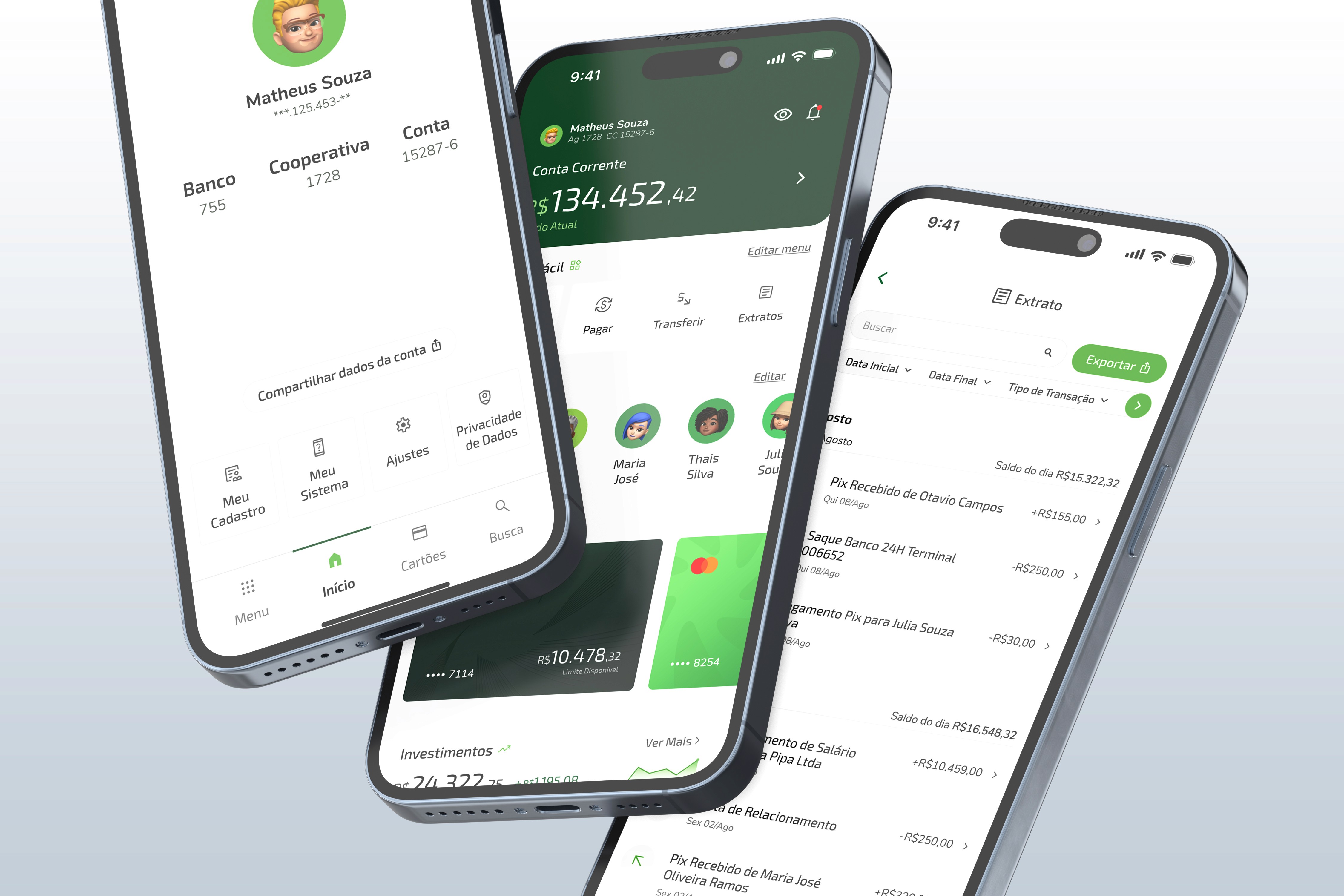
Current Sicredi App Interface
The Redesign Process
To achieve these goals, I followed a structured design approach:
Research and Analysis
Conducted a review of the current app’s user experience and benchmarked it against other leading banking apps to identify key areas for improvement.Wireframing
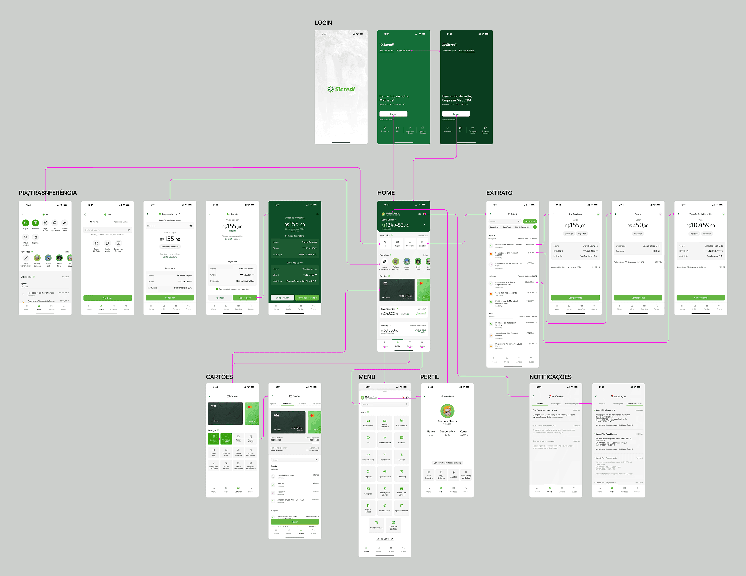
Created wireframes to map out simplified workflows for key functions, focusing on minimizing the steps required to complete actions such as transfers, bill payments, and account management.Visual Design
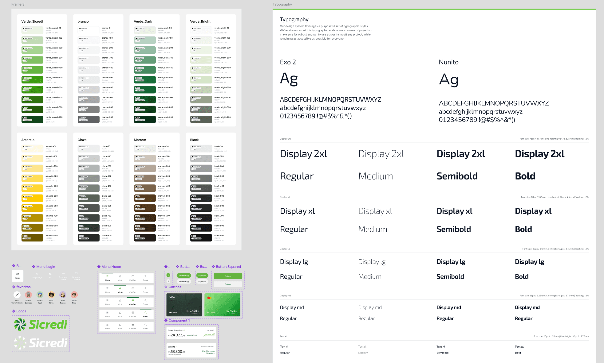
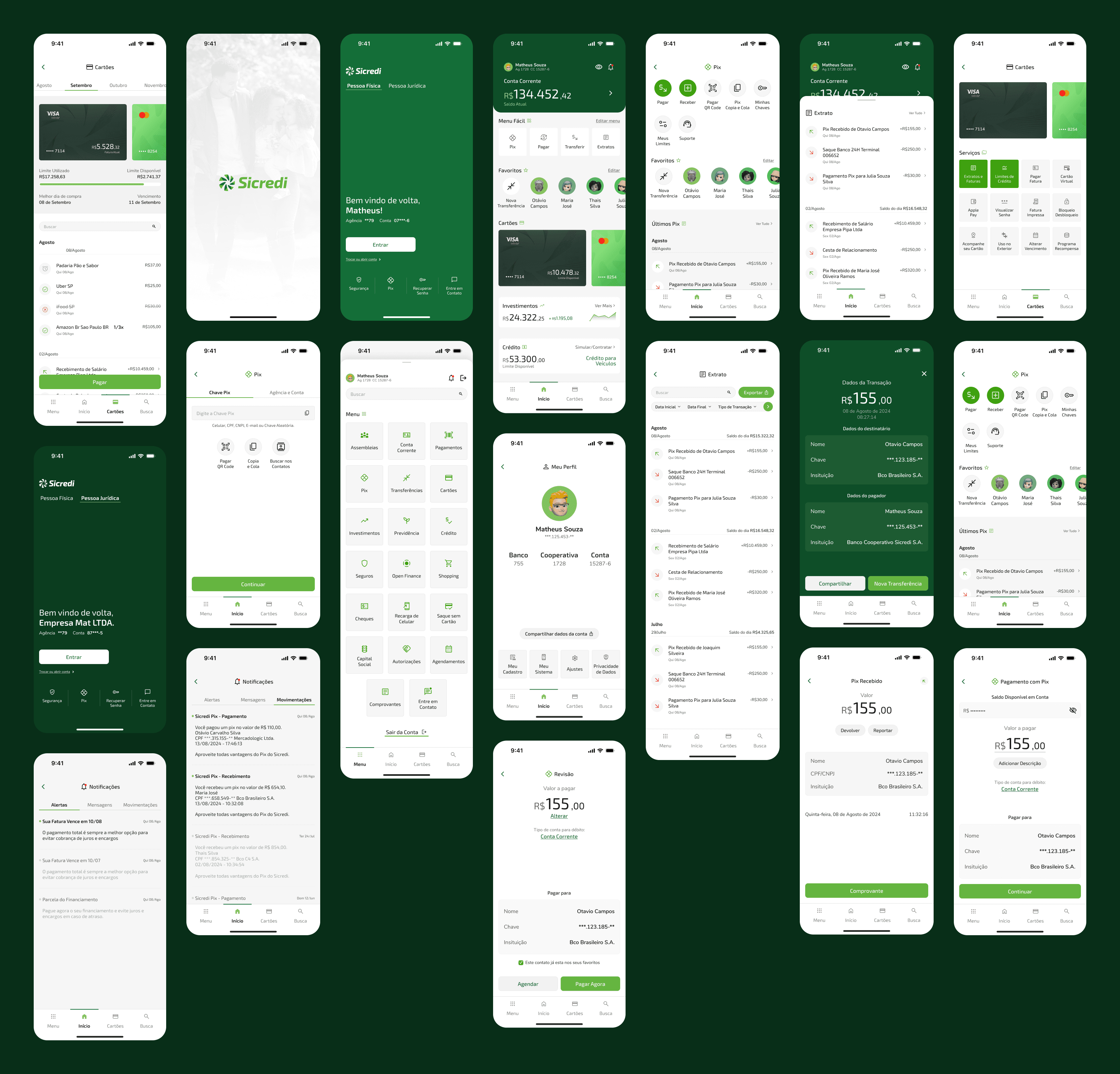
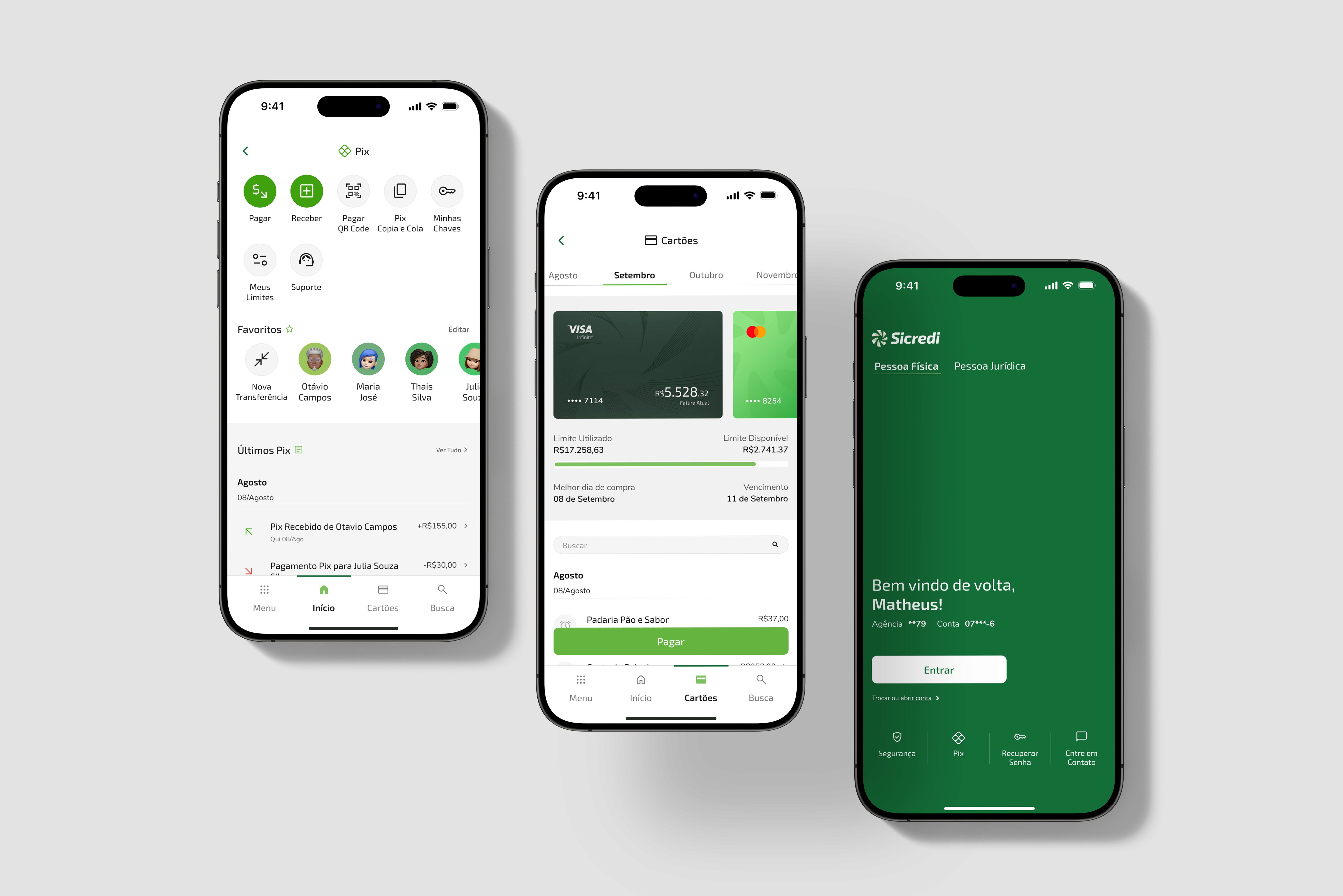
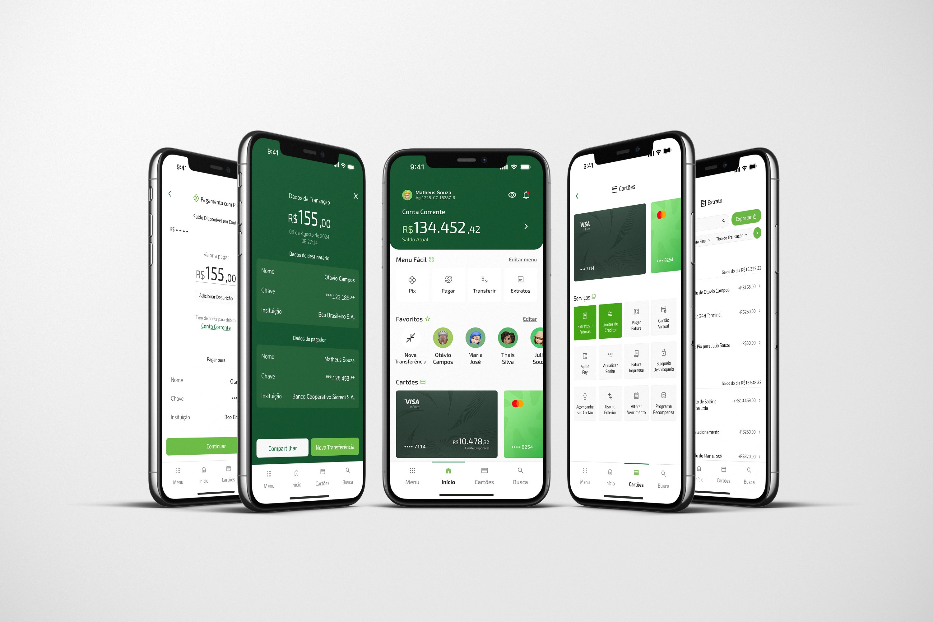
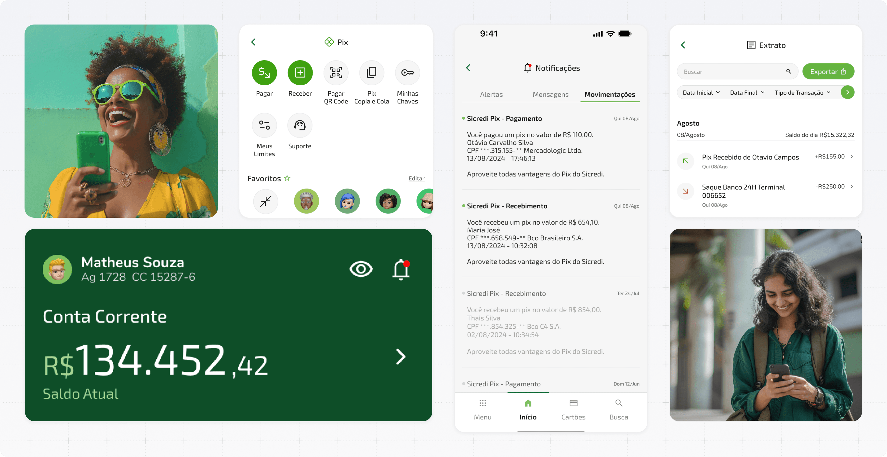
Developed high-fidelity mockups that emphasized clean, modern aesthetics, and improved user interface elements. This included larger buttons for easier touch navigation, high-contrast color schemes for better visibility, and consistent, readable typography.Prototyping
Built an interactive prototype to demonstrate the redesigned app’s functionality and gather feedback on the improved user flow and design elements.
Design Goals
With these challenges in mind, I set out to achieve the following goals in my redesign:
Streamline User Experience: Reduce the number of steps required to perform common banking tasks, making the app more efficient and user-friendly.
Enhance Accessibility: Incorporate larger buttons, high-contrast colors, and improved readability to make the app more accessible to all users, including those with visual impairments.
Improve Readability: Use clear typography, adequate spacing, and thoughtful layout design to enhance the readability of information and ensure users can easily navigate and understand content.
Increase App Quality: Modernize the app’s design to reflect a high-quality, contemporary aesthetic that aligns with user expectations for a digital banking experience.
Impact and Reflection
While this was a conceptual project undertaken independently, it provided an opportunity to apply user-centered design principles to a real-world context. Key takeaways from this redesign include:
User Experience Focus
The importance of reducing friction and simplifying processes to create a more efficient and satisfying user experience.Accessibility Considerations
Learning how to effectively incorporate accessibility features into a mobile app design to make it usable for a broader audience.Design Quality
The value of high-quality design in enhancing brand perception and user trust in digital products.
These metrics underscore the effectiveness of the rebranding and design overhaul, demonstrating a clear return on investment and positioning GovAssist for sustained growth and success.
Key Features of the Redesign
Streamlined Navigation: A simplified menu structure and reduced number of steps for completing tasks, allowing users to achieve their goals more quickly and efficiently.
Accessible Design: Enhanced accessibility with larger buttons and touch targets, high-contrast color palettes, and design elements that cater to users with visual impairments.
Improved Readability: Clear and consistent typography, thoughtful use of white space, and organized content layout to make information easier to read and understand.
Modern Visual Style: A refreshed aesthetic with a focus on clean, minimalist design, creating a more polished and professional look for the app.
Conclusion
This personal project showcases my ability to improve app usability and accessibility through thoughtful design. While unofficial, the redesign reflects a commitment to enhancing user experiences and ensuring digital products are inclusive and high-quality.